Testing Without a Manual
Testing Without a Manual
Field Research for India's Non-Literate Users
Field Research for India's Non-Literate Users

Overview
Can you design for users who've never seen a button?
Can you design for users who've never seen a button?
In 2025, the team behind one of India's most popular mobile games was building a voice-first messaging app for their non-literate user base. The product was ready to launch. The dev team wanted to skip usability testing. The product owner agreed.
Our design agency pushed back. If the app failed with its core audience, there'd be no second chance.
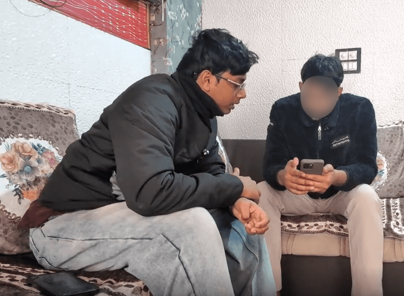
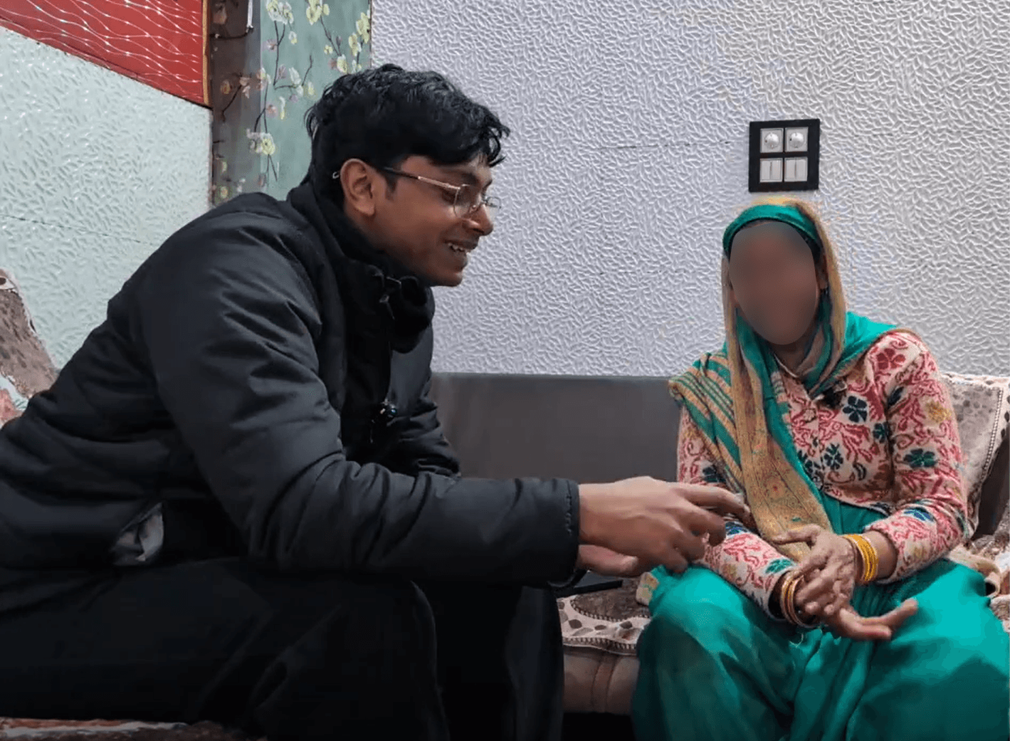
I was brought in to lead field research. Over five days in Sadpura, Haryana, I moderated 14 in-person sessions testing whether people who'd never seen a "send button" could actually use this app.
In 2025, the team behind one of India's most popular mobile games was building a voice-first messaging app for their non-literate user base. The product was ready to launch. The dev team wanted to skip usability testing. The product owner agreed.
Our design agency pushed back. If the app failed with its core audience, there'd be no second chance.
I was brought in to lead field research. Over five days in Sadpura, Haryana, I moderated 14 in-person sessions testing whether people who'd never seen a "send button" could actually use this app.
The result
The result
Research prevented a failed launch and drove 4 major redesigns before market entry.
Research prevented a failed launch and drove 4 major redesigns before market entry.
My Role
Lead Field Researcher
Lead Field Researcher
I was responsible for:
Adapting the moderation script for non-literate participants
Conducting all 14 sessions independently
Making real-time methodology decisions based on participant behavior
Contributing to synthesis and recommendations
I worked with a lead researcher who designed the overall study structure.
The Participants
The Participants
14 users across 4 personas
14 users across 4 personas
All were Hindi speakers, some with Gurjar accent. All owned smartphones, but their interaction vocabulary was limited: scroll, tap video, repeat.
All were Hindi speakers, some with Gurjar accent. All owned smartphones, but their interaction vocabulary was limited: scroll, tap video, repeat.
3 working professionals
3 students
4 homemakers
4 unemployed individuals


Images Movement
Text Appear
Then things took a turn
Then things took a turn
First session went smooth, second broke me
First session went smooth, second broke me
Second participant felt that he was being tested even after reinforcing that the its the product's test. He gave one-word answers. He was visibly defensive and barely spoke. The standard "think aloud" protocol wasn't working. It was adding pressure, not revealing insights.
That night, I reviewed the recordings and rewrote my approach.
What I changed
What I changed
Built rapport before testing
Built rapport before testing
Before session 2, I'd give a brief intro and jump into the session. After, I changed my approach. I introduced my team, made small jokes, asked about their day casually. I was trying to shift the power dynamic. Once participants saw us as people, not evaluators, they relaxed.
Before session 2, I'd give a brief intro and jump into the session. After, I changed my approach. I introduced my team, made small jokes, asked about their day casually. I was trying to shift the power dynamic. Once participants saw us as people, not evaluators, they relaxed.
Reframed the purpose
Reframed the purpose
I added an explanation: "This app was made for people like you. We're here to learn from you, not test you. Even if something doesn't work, that's valuable information for us."
I added an explanation: "This app was made for people like you. We're here to learn from you, not test you. Even if something doesn't work, that's valuable information for us."
Shifted from "think aloud" to targeted probing
Shifted from "think aloud" to targeted probing
Instead of asking them to narrate every action, I asked specific questions after they got stuck. This reduced cognitive load and revealed honest reactions.
Instead of asking them to narrate every action, I asked specific questions after they got stuck. This reduced cognitive load and revealed honest reactions.
Adjusted for phone anxiety
Adjusted for phone anxiety
I noticed some participants being very careful while holding the phone fearing they might drop it or damage it. So I added a line: "Even if you accidentally break this phone today, we'll be fine with it. In fact, we'll give you a gift." This worked, they relaxed immediately.
I noticed some participants being very careful while holding the phone fearing they might drop it or damage it. So I added a line: "Even if you accidentally break this phone today, we'll be fine with it. In fact, we'll give you a gift." This worked, they relaxed immediately.
Removed observers when needed
Removed observers when needed
In 3 sessions, I asked team members to wait outside because the participant was too self-conscious. One-on-one, they opened up.
In 3 sessions, I asked team members to wait outside because the participant was too self-conscious. One-on-one, they opened up.
The meta-change
The meta-change
When my lead reviewed all 14 recordings later, they pointed out something I hadn't fully realized: I was a completely different person in session 1 versus session 14.
I have a naturally stern tone and formal posture. In early sessions, this made me intimidating. So I adjusted consciously. I softened my voice, changed my body language, became hyper-aware of how participants reacted to my presence.
THE LESSON
Sometimes the biggest usability barrier isn't the interface, it's the researcher.
Sometimes the biggest usability barrier isn't the interface, it's the researcher.
The strategic shift
The strategic shift
Testing Different Things for Different Users
Testing Different Things for Different Users
Early on, I noticed a pattern
Digitally literate users(professionals, students) explored freely. They'd recover from mistakes and keep trying.
Low-literacy users (homemakers, unemployed) froze when confused. They didn't explore—they gave up.
So I adjusted what I tested for each group.
Early on, I noticed a pattern
Digitally literate users(professionals, students) explored freely. They'd recover from mistakes and keep trying.
Low-literacy users (homemakers, unemployed) froze when confused. They didn't explore—they gave up.
So I adjusted what I tested for each group.
High-literacy users: Feature discoverability, task efficiency
Low-literacy users: Learnability, confidence, error recovery
For low-literacy participants, if they couldn't discover a feature after 30 seconds, I'd demonstrate it, then ask them to replicate it in a new scenario. This revealed whether the interface was learnable, not just discoverable.
For low-literacy participants, if they couldn't discover a feature after 30 seconds, I'd demonstrate it, then ask them to replicate it in a new scenario. This revealed whether the interface was learnable, not just discoverable.
What We Found
What We Found
Onboarding Failed to Communicate Value
Onboarding Failed to Communicate Value
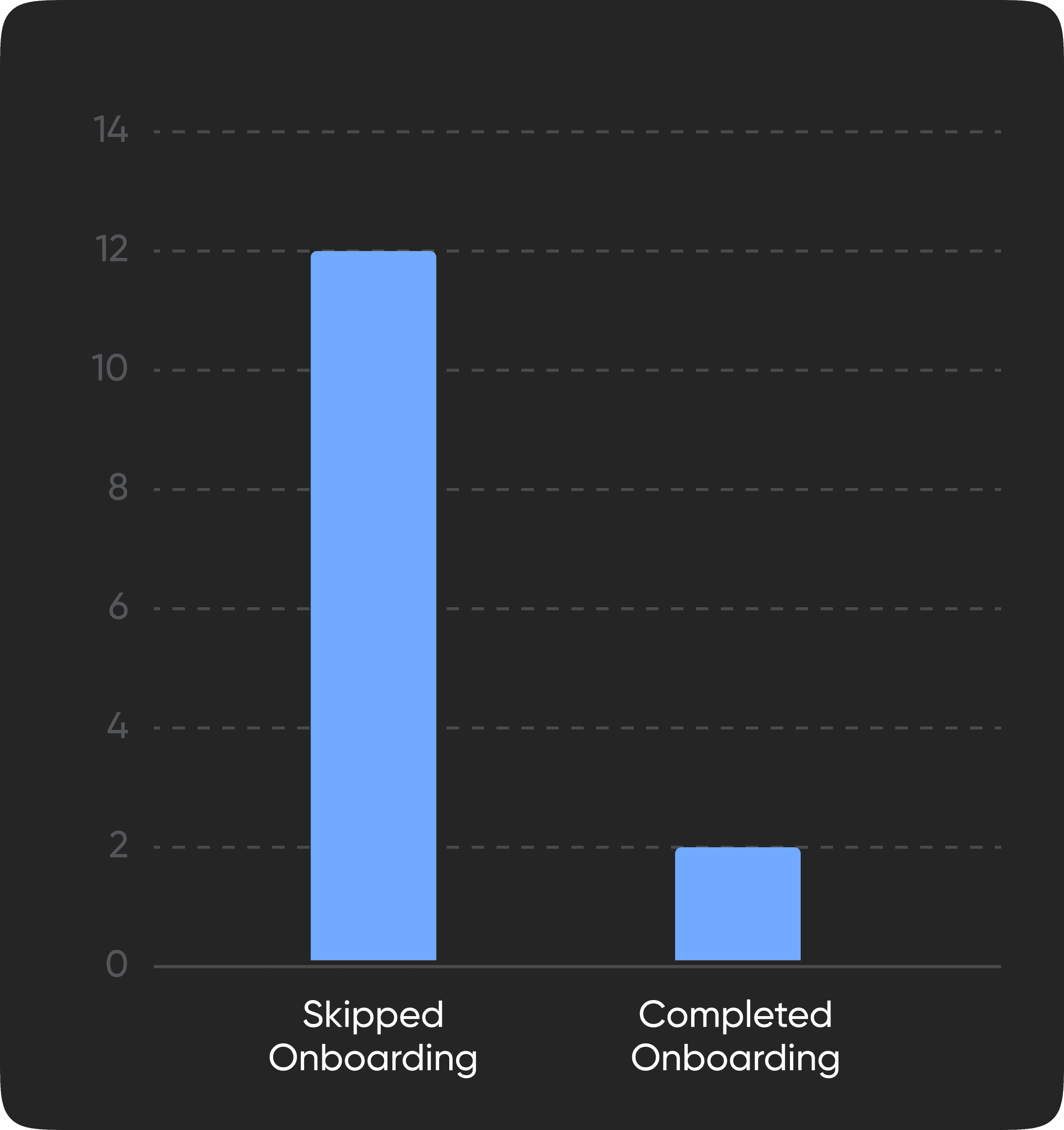
12 out of 14 participants skipped the first slide immediately. Only 5 could vaguely describe the app afterward. Three tried speaking to the app during onboarding.
12 out of 14 participants skipped the first slide immediately. Only 5 could vaguely describe the app afterward. Three tried speaking to the app during onboarding.
What happened:
The onboarding had 3 slides with voiceover. The first two were marketing copy. By the time users reached the actual explanation (slide 3), they'd tuned out. When I asked the three who spoke to their phones why they did it, they said the voiceover sounded like the app was asking them a question.
The Insight:
The onboarding needs to convey the app's value to the user from the 1st slide. Marketing copy just turns them away.
The Insight:
The onboarding needs to convey the app's value to the user from the 1st slide. Marketing copy just turns them away.
The Redesign:
Onboarding was replaced with a short video showing a real person using the interface. Visual demonstration, not marketing messaging.
The Redesign:
Onboarding was replaced with a short video showing a real person using the interface. Visual demonstration, not marketing messaging.
Standard Interaction Patterns Don't Exist Here
Standard Interaction Patterns Don't Exist Here
What happened:
A 35-year-old homemaker swiped a button four times before looking at me, confused. When I nudged her to tap instead, her face lit up, she'd just realized you can tap on a button. Her only prior interaction? Scrolling YouTube Shorts. Swiping was her entire vocabulary.
This happened with 3 homemakers. Meanwhile, all 6 high-literacy users tapped immediately.
Another example:
Only 6 out of 14 participants recognized the microphone icon correctly. The others thought it was search (because they use voice search on YouTube).
The Insight:
Mental models aren't universal. What designers call "standard UI patterns" assume years of app exposure. For users whose only touchpoint is vertical video feeds, buttons and icons aren't intuitive.
The Insight:
Mental models aren't universal. What designers call "standard UI patterns" assume years of app exposure. For users whose only touchpoint is vertical video feeds, buttons and icons aren't intuitive.
The Redesign:
Icons were redesigned to be more literal and direct. Visual language was rebuilt carefully by considering the user's context, not borrowed from WhatsApp or Telegram.
The Redesign:
Icons were redesigned to be more literal and direct. Visual language was rebuilt carefully by considering the user's context, not borrowed from WhatsApp or Telegram.
The Two-Handed Discovery
The Two-Handed Discovery
The feature:
Push-to-talk. Hold a contact's profile to start recording. While holding, slide your finger to Lock or Delete.
The feature:
Push-to-talk. Hold a contact's profile to start recording. While holding, slide your finger to Lock or Delete.
What we expected:
Users would hold and slide.
What we expected:
Users would hold and slide.
What happened:
A 34-year-old homemaker held the mic with one finger, then tried tapping Lock with another finger from her other hand.
This happened with 2 low-literacy participants.
What happened:
A 34-year-old homemaker held the mic with one finger, then tried tapping Lock with another finger from her other hand.
This happened with 2 low-literacy participants.

The insight:
The gesture we designed (hold + slide) assumed familiarity with compound interactions. These users interpreted "hold" and "tap sub-action" as two separate steps requiring two hands.
Only 6 out of 14 participants discovered push-to-talk independently, all high-literacy users. The other 8 didn't explore. They waited for instruction. Discovery wasn't just hard for them, it was anxiety-inducing.
The redesign:
A visual swipe indicator was added showing exactly where to drag. The home screen was changed to list view (12/14 preferred it), and an FTU tutorial was added to walk users through push-to-talk immediately after onboarding.
The redesign:
A visual swipe indicator was added showing exactly where to drag. The home screen was changed to list view (12/14 preferred it), and an FTU tutorial was added to walk users through push-to-talk immediately after onboarding.
Synthesis Approach
Synthesis Approach
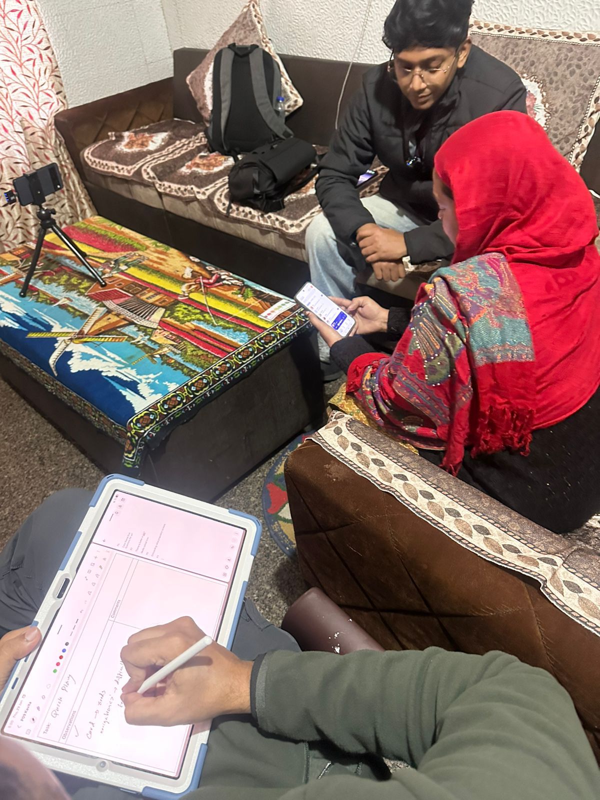
We split 14 recordings, organized observations by theme, and delivered findings as a presentation backed by an evidence spreadsheet with timestamped video clips.
Impact
Impact
4 major redesigns driven by field research
4 major redesigns driven by field research
Onboarding: Replaced text + voiceover with visual walkthrough video
Push-to-talk interaction: Added swipe path indicator for gesture clarity
Home screen: Made list view default, added FTU tutorial for core features
Iconography: Redesigned icons to be more literal for easier recognition
Stakeholder reaction
Stakeholder reaction
The product owner and marketing head were most surprised by the two-handed interaction finding. While no one pushed back on recommendations, the research validated the need for testing, the initial skepticism shifted.
The product owner and marketing head were most surprised by the two-handed interaction finding. While no one pushed back on recommendations, the research validated the need for testing, the initial skepticism shifted.
What I'd do differently
What I'd do differently
Test my synthesis framework before field
Test my synthesis framework before field
I organized findings using a structure the lead created. Next time, I'd pilot my own synthesis framework on the first 2-3 sessions to see what works, testing different ways to cluster observations.
I organized findings using a structure the lead created. Next time, I'd pilot my own synthesis framework on the first 2-3 sessions to see what works, testing different ways to cluster observations.
Capture insights immediately
Capture insights immediately
We synthesized from video later. Some behavioral cues are easier to catch in person. I'd use a post-session form to note these while fresh.
We synthesized from video later. Some behavioral cues are easier to catch in person. I'd use a post-session form to note these while fresh.
Be in the stakeholder room
Be in the stakeholder room
The lead researcher presented findings. Next time, I'd push to present or observe, to see which insights land and how to frame research for influence.
Reflections
Reflections
Usability testing isn't one framework that fits all
Usability testing isn't one framework that fits all
Tests should evolve based on who you are testing with.
For high literacy users, you test efficiency, and discoverability. For low literacy users you test learnability and confidence. For this audience, "usable" didn't mean fast or intuitive. It meant learnable after one demonstration. That reframed everything.
Trust your gut
Trust your gut
Blindly following standard process without paying attention to the actual situation at hand will stop you from adapting to real constraints. When the standard playbook doesn't work, you adapt. Mid-field. On your own judgment.
That's the part I'm most proud of :)
Blindly following standard process without paying attention to the actual situation at hand will stop you from adapting to real constraints. When the standard playbook doesn't work, you adapt. Mid-field. On your own judgment.
That's the part I'm most proud of :)
Want to chat or debate about design?
I'm down for both.